Introduction
You have probably saved dozens of photos online. Pinterest boards full of beautiful rooms. Instagram posts you keep coming back to. But when you look at your own living room, something feels off.
Maybe the furniture is fine. Maybe the colors are okay. But the room just does not look like those magazine photos you love so much.
Here is the truth. Those rooms did not happen by accident. They follow specific rules. Rules about lighting, scale, color, and what to remove. Not just what to add.
This article gives you 18 specific ideas you can actually use. No expensive designer needed. No full renovation. Just smart choices that change how your room looks and feels.
Pick three and start this weekend. You will see the difference fast.
1. Start With a Neutral Base, Then Add Color Slowly

Most people get this backwards. They pick a bold wall color first. Then they struggle to make furniture work around it.
Start neutral instead.
Warm whites, soft taupes, and greige tones work in almost every room. They make your furniture stand out. They make your space feel calm and clean. And they photograph beautifully, which is exactly why you see them in magazines constantly.
Cold gray walls were popular years ago. That trend is over. In 2026, warm neutrals are what top designers choose first. Colors like Benjamin Moore White Dove or Sherwin Williams Accessible Beige stay popular because they work with almost everything.
Once you have a neutral base, you can add color through pillows, rugs, and plants. This approach saves you money. You can change the mood of the room without repainting.
Do this first: Paint your walls a warm white or soft taupe before buying anything new. Everything else gets easier after that.
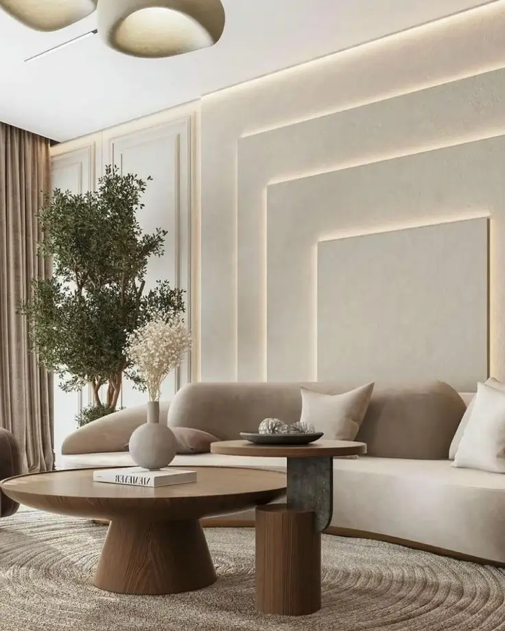
2. Choose Low Profile Furniture for a Clean, Open Feel

Big chunky furniture makes rooms feel smaller and heavier than they really are.
Low profile furniture does the opposite. Sofas and coffee tables that sit closer to the ground make your ceiling feel higher. They create more visual breathing room. The whole space feels lighter.
Look for furniture with visible legs. Tapered wood or metal legs are a key feature of modern design. When you can see the floor under your sofa, the room feels open and airy.
This does not mean you need small furniture. It means choosing pieces that do not overwhelm the room. A sofa should take up no more than two thirds of the wall behind it.
Mid century modern shapes work great here. Clean lines, simple angles, no heavy decorative details. These pieces look expensive even when they are not.
Quick check: If your sofa sits flat on the floor with no legs, that is the first thing worth changing.
3. Try Tonal Layering, Which Means Using One Color in Many Shades
Tonal layering sounds complicated. It is not.
It means picking one color family and using different shades and textures of it throughout the room. All beige but in linen, leather, wood, and cotton. All cream but matte on the walls, soft on the pillows, glossy on a vase.
This is why some rooms look so put together even though they are not colorful. The variety comes from texture, not color.
Boucle fabric, which has that bumpy looped texture, has stayed popular since 2022 for exactly this reason. It adds richness without adding color.
Try this with pillows first. Pick three pillows in the same color but different materials. One velvet, one linen, one boucle. Same color, very different look. That is tonal layering in its simplest form.
Why this works: Magazines love tonal rooms because they are easy to photograph. The look is calm, rich, and intentional all at once.
4. Pick One Statement Sofa and Build the Room Around It

Your sofa is the most important piece of furniture in the room. It takes up the most space. It is the first thing people notice. Get this right and everything else becomes easier.
In 2026, color forward sofas are everywhere. Deep forest green. Rust and terracotta. Rich navy blue. These colors look bold in a store but beautiful in a neutral room.
If that feels risky, velvet in a warm neutral like camel or blush works just as well.
The fabric matters a lot. Boucle, performance linen, and velvet are the top choices right now. They hold their shape, they look elevated, and they feel good to sit on.
One practical rule: leave 18 inches of walking space on each side of the sofa. Pushing furniture against the wall actually makes rooms feel smaller. Pull the sofa slightly into the room instead.
The bottom line: Spend more on the sofa than anything else. It is the one piece that sets the tone for the whole room.
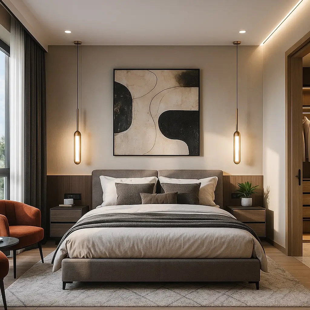
5. Add at Least Three Sources of Light, Not Just One Overhead Light

This is the biggest mistake in most homes. One overhead light in the center of the ceiling makes a room feel flat and cold. It looks like an office, not a living room.
Great rooms use three types of light:
Ambient light is your main light source. A ceiling fixture or recessed lights.
Task light is for reading or focused activity. A floor lamp beside a chair works perfectly.
Accent light highlights something specific. A small lamp on a shelf or table adds warmth and depth.
You want bulbs between 2700K and 3000K. That range gives you warm light, not the harsh blue white you see in hospitals. This single change makes a room feel instantly cozier.
Adding a dimmer switch costs very little and changes everything. You can set bright light for daytime and soft warm light for evenings without buying anything new.
Smart bulbs like Philips Hue let you control color temperature and brightness from your phone. Useful if you want different moods throughout the day.
Start here: Add one floor lamp tonight. You will immediately see why designers consider layered lighting the most important element in any room.
6. Add One Curved or Organic Shaped Piece

Most rooms are full of straight lines. Square furniture, rectangular rugs, flat walls. That gets visually tiring fast.
One curved piece breaks that up in the best way.
It does not need to be a full curved sofa. An arch mirror. A round coffee table. A kidney shaped ottoman. Even a curved chair in a corner. One is enough.
The organic modern style, which mixes clean modern design with softer natural shapes, is one of the most searched interior styles right now. Houzz, Apartment Therapy, and Architectural Digest have all featured it consistently for the past two years.
Curves make a room feel more welcoming. They soften the hard edges without making the space look messy or soft.
Easy option: An arch mirror is the fastest way to add a curved element. It also makes the room feel bigger. Two benefits in one piece.
7. Create an Accent Wall That Actually Does Something
Not all accent walls are equal. Painting one wall a slightly different shade is not enough anymore.
In 2026, the best accent walls use texture and material, not just color. Here are four options that actually work:
Limewash paint creates a soft, aged texture on the wall. It looks like old Italian plaster. You can do it yourself with a brush and a can of limewash paint. Searches for this technique exploded after it started showing up on Instagram and YouTube design channels.
Wood slat panels are flat vertical strips of wood installed side by side. They look expensive and architectural. They are widely available on Amazon and at most home improvement stores.
Plaster finish gives a smooth organic texture that catches light differently throughout the day.
Stone veneer works especially well behind a fireplace or TV.
The rule for accent walls: the wall should frame something important. A fireplace, a TV, or the sofa wall. A random accent wall on a side wall with nothing in front of it looks awkward.
Best color choices right now: Deep green, charcoal, and terracotta are the top accent wall colors in modern living rooms this year.
8. Use Natural Materials to Add Warmth Without Looking Rustic

Modern does not mean cold. A room full of metal, glass, and white paint can feel sterile fast.
Natural materials fix that. Wood, rattan, stone, linen, and jute all add warmth without making a room look like a farmhouse.
The key is using natural materials as accents, not the main story. A wood coffee table with a stone or glass top. A jute rug under modern furniture. A rattan side chair next to a sleek sofa.
Biophilic design, which means bringing natural elements indoors, has real research behind it. Studies in environmental psychology show that natural materials and textures lower stress and improve how people feel in a space. Designers use this knowledge intentionally.
The mistake people make is going too heavy. All rattan everywhere looks dated fast. One or two natural pieces in a mostly modern room look curated and intentional.
Simple swap: Replace a synthetic rug with a wool or jute rug. The texture difference alone changes how the room feels.
9. Style Your Coffee Table Using the Rule of Three

A coffee table covered in random stuff looks messy. An empty coffee table looks forgotten. The sweet spot is three to five items, arranged with purpose.
Here is a simple formula that works every time:
Pick one tall item. A vase with a single stem or a small plant.
Pick one medium item. A stack of two or three coffee table books.
Pick one low item. A candle or a small sculptural object.
Add a tray to group everything together. The tray makes the whole arrangement look intentional, even if it took you two minutes.
Keep everything in a similar color family. White, cream, and wood tones. Or black, brass, and dark green. Mixing too many colors on a coffee table looks cluttered no matter how few items you have.
Interior stylists say this is one of the most viewed topics on design YouTube channels. People want to know exactly what to put there. Now you do.
Remove first: Any functional items like TV remotes, chargers, or coasters should go in a small box or drawer. They break the look immediately.
10. Get a Rug That Is Actually Big Enough

This is the most common mistake in living rooms. The rug is too small.
A small rug makes furniture look like it is floating randomly in a room. It does not define the space. It just sits there looking awkward.
The rule is simple. All four legs of your sofa should either sit fully on the rug or at least have their front legs touching it. If your rug is not large enough for that, it is the wrong size.
For most living rooms, an 8 by 10 foot rug is the minimum. A 9 by 12 is better for larger spaces.
Low pile and flatweave rugs look most modern. They are also easier to clean and work well under furniture.
Layering two rugs is a technique designers use to add texture and interest. A flat jute rug as the base, then a smaller patterned rug on top. It looks intentional and editorial.
Before you buy: Tape out the rug dimensions on your floor with painter’s tape. You will see immediately whether the size works before spending any money.
11. Hang Your Art at the Right Height

Most art in homes is hung too high. People look at blank wall above the sofa and think the art should go there. But that puts the art at a level nobody looks at naturally.
The standard rule used by professional galleries is to hang art so the center is at 57 to 60 inches from the floor. That is roughly eye level for most adults standing up.
Above a sofa, the bottom of the art should be about 6 to 8 inches above the back cushions. Not a foot above. Not touching them. Just a short gap.
For gallery walls, keep one consistent element. Same frame color, same frame material, or same mat color. Vary the sizes. This gives a collected, intentional look instead of random.
Large format art prints are one of the most affordable ways to make a room look expensive. A 24 by 36 print in a simple frame has more impact than a dozen small pieces scattered around.
Where to find good affordable art: Society6, Desenio, and Artprint from Etsy shops are worth checking. Many artists sell direct prints at reasonable prices.
12. Use Vertical Elements to Make Your Room Feel Taller

Most people only think about horizontal space. What goes on the floor, what goes on the wall at eye level. But vertical space is free real estate most rooms never use.
Tall bookshelves pull the eye upward. This makes the ceiling feel higher. Even in a room with average height ceilings, tall shelving creates the illusion of more space.
Tall plants work the same way. A fiddle leaf fig or bird of paradise placed in a corner adds height and life without taking up floor space.
Curtains are the easiest vertical trick available. Most people hang curtains right above the window frame. Hang them as close to the ceiling as possible instead. Let them fall all the way to the floor. This one change can make your room feel 30 percent taller. Interior designers recommend this universally.
The curtains do not need to be fancy. Simple linen panels in an off white or warm gray work in almost any room.
One change, big result: Move your curtain rods up to just below the ceiling this weekend. The difference is immediate.
13. Edit Your Room Down to What Actually Belongs There

Here is the secret behind every beautiful magazine room. Somebody removed 40 percent of what was originally in it.
Magazine rooms look good because they are edited, not because they are full.
Visual clutter raises stress levels. Research in environmental psychology backs this up consistently. Too many objects competing for attention make a room feel chaotic even when each individual item is nice.
Start by removing everything from the room that does not need to be there. Then put back only what earns its place.
Things to remove first:
Excessive throw pillows beyond five on a sofa. Random knick knacks that have been sitting in the same spot for years. Visible cords behind the TV. Anything sitting on the floor that should be stored away.
Replace visible storage with hidden storage. Ottomans with lids that open. Media consoles with doors. Baskets with lids. These keep things accessible but out of sight.
White space is not emptiness. It is intentional breathing room. Every great room has it.
The camera test: Take a photo of your room right now. Look at the photo, not the room. You will immediately see what does not belong.
14. Mix Your Metal Finishes on Purpose
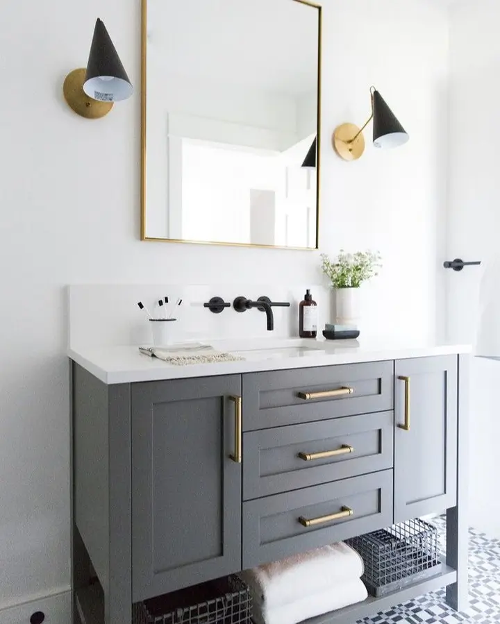
For a long time, the rule was: match all your metals. All gold or all chrome or all silver. That rule is gone.
Modern design mixes metals intentionally. The key word is intentionally.
Pick one dominant metal that appears most often. Brushed brass or matte black are the most popular choices in 2026. Then pick one accent metal to use in smaller doses. They can contrast or complement.
Popular combinations right now: brushed brass with matte black. Chrome with warm gold. Aged bronze with raw steel.
The one rule that matters: each metal should appear at least twice in the room. One gold lamp and one gold frame. One black fixture and one black table leg. Repetition is what makes mixing metals look planned rather than random.
Where metals show up: light fixtures, furniture legs, curtain rods, mirror frames, side table frames, vases, and decorative objects.
Easy starting point: Swap out your lamp for a brushed brass one. Then find one more small item in the same finish. That is a complete intentional metal moment.
15. Add a Mirror to Open Up the Room

Mirrors do two things at once. They make a room feel bigger. And they bounce natural light around the space.
For maximum impact, place a mirror on the wall opposite a window. The mirror reflects the light coming in and distributes it through the room. This is especially useful in darker rooms or north facing spaces.
Arch mirrors have been one of the most purchased home decor items since 2023 and remain a top choice in 2026. They add a curved element while also functioning as a design focal point.
Leaning an oversized mirror against the wall instead of hanging it looks relaxed and editorial. It also avoids putting holes in walls, which renters appreciate.
The mirror itself can be the art. You do not always need a decorative frame. A simple clean edge mirror in a strong shape does the job well.
For small rooms: A large leaning mirror in a corner can visually double the size of a small living room at minimal cost.
16. Put One Large Plant in the Room

This is one of the cheapest changes with one of the highest impacts.
A large plant adds life, color, texture, and organic shape all at once. It does things furniture and decor cannot do.
The best statement plants for modern living rooms are:
Fiddle leaf fig for height and dramatic large leaves. Monstera for bold tropical shape. Bird of paradise for a sculptural look. Olive tree for a softer, more organic feel.
Place the plant on the floor in a corner beside the sofa, or flanking the TV console. Floor level plants feel intentional and designed. Small plants on shelves do not have the same impact.
The planter matters too. Ribbed ceramic, stone, or terracotta all work well with modern rooms. Avoid cheap plastic pots. The planter is part of the design.
If you are not a plant person, snake plants and ZZ plants are nearly indestructible. Low water, low light, still look great.
Cost comparison: A large fiddle leaf fig costs less than one throw pillow from a high end store. The visual impact is not even close.
17. Upgrade Your Throw Pillows Using a Simple Formula

Random pillows in different sizes, patterns, and colors make even a great sofa look messy.
Here is the formula that works. Two large square pillows at 22 by 22 inches. Two medium pillows at 18 by 18 inches. One lumbar pillow, which is the long rectangular one. That is five pillows total for a standard sofa.
Mix textures, not necessarily colors. One boucle, one linen, one velvet in the same color family looks rich and layered. Three different patterns in three different colors looks busy.
The throw blanket is the final layer. Do not fold it neatly over the arm of the sofa. Drape it loosely. Let part of it fall. Styled imperfection looks more natural and more high end than rigid neatness.
Swapping pillows seasonally is one of the easiest ways to refresh a room without buying anything major. Lighter linen in spring and summer. Richer velvet and wool in fall and winter.
Pillow rule: Odd numbers work better than even. Three pillows on a smaller sofa looks better than two or four.
18. Control What People See When They Walk In the Room

The first view someone gets of your living room is from the doorway. That view matters most.
Stand at your main entrance and look at the room. Everything visible from that angle should be placed there on purpose. If something looks out of place from that view, it probably is.
This is called the camera test. Designers and home stagers use it constantly. Taking an actual photo forces you to see the room as a stranger would. Problems you stopped noticing become obvious immediately.
TV walls are a common challenge. A TV mounted on a blank wall looks like a screen in an office. Style around it. A floating shelf below with a few objects. Art pieces on either side. Or a simple media console that makes the TV part of a complete composition.
Cords are the enemy of modern design. A cable management kit from any hardware store costs very little and takes 20 minutes to install.
Finish with one fresh or dried stem in a minimal vase near the entrance. It signals that the room is looked after. Small detail, strong message.
Final step: Take a photo of your room right now. Then take another one after making three changes from this list. The difference will be clear.
Conclusion
You do not need to renovate. You do not need to spend a lot of money. And you definitely do not need a designer telling you what to do.
You need a neutral base, the right size rug, layered lighting, and a ruthlessly edited space. Get those four things right and the rest falls into place naturally.
Start with three ideas from this list. The camera test, the rug size check, and adding a floor lamp are the three highest impact changes you can make this weekend with minimal cost.
These 18 modern living room ideas prove that great interior design is less about spending more and more about choosing better.
Pick one. Start today.