Your living room isn’t too small — your current layout is just lying to you.
You’ve tried pushing furniture against walls. You bought a coffee table that mostly hurts your shins. And somehow your space still feels like a storage unit with a couch.
Here’s the truth. Small rooms don’t have to feel cramped. You just need a few smart moves.
In this guide, you’ll get 14 actionable, 2026-tested strategies. We’re talking optical illusions, AI-powered layout tools, and furniture that works twice as hard. No renovation needed. Just better decisions.
Let’s make every inch count.
1. Start With a “Traffic Flow First” Floor Plan

Most people buy furniture first. Then they try to walk around it. That’s backwards.
Measure your pathways before you buy anything. You need at least 24 inches for one person to walk comfortably. 30 inches is better.
Use free tools like Roomstyler or MagicPlan (both updated for 2026 with AR measuring). Drop in your room dimensions. Then test furniture arrangements without lifting a finger.
Here’s a trick that works every time. Pull your sofa 6 to 12 inches off the wall. Yes, away from the wall. This creates breathing room and makes the space feel bigger, not smaller.
Zone your room with rugs, not walls. A 5’x7’ rug under the sofa says “living area.” A small round rug by the window says “reading nook.”
Stat: A 2025 Houzz survey found that 42% of small-space owners said poor traffic flow was their #1 regret after furnishing.
Example: In a 12’ x 12’ living room, place a 72” sofa at a slight angle. Not flat against the wall. You’ll create two distinct zones instantly.
🔑 Key takeaway: Map your walking paths first. Then add furniture.
2. Choose “Transformers” – Multifunctional Furniture That Actually Works

Not all multifunctional furniture is good. Some of it is clunky junk.
Look for “hidden hinge” designs in 2026. These are modular pieces with no visible conversion hardware. They look like regular furniture until you need them to change.
Lift-top coffee tables are great for storing blankets and remotes. Drop-leaf tables are better for tight spaces where you need occasional dining space.
The best budget trick: Buy an ottoman with interior storage. Then put a rigid tray on top. Now you have a coffee table, a storage bin, and extra seating all in one.
For people who work from home, skip the murphy bed. Get a murphy desk. It folds flat against the wall and takes up just 4 inches of depth.
Stat: IKEA’s 2025 Life at Home report found that 61% of people in cities under 600 sq ft own at least one piece of multifunctional furniture.
Example: The IKEA Norden gateleg table folds to 10 inches deep but seats four people when open. That’s a win.
🔑 Key takeaway: One piece of furniture should do at least two jobs. Three is even better.
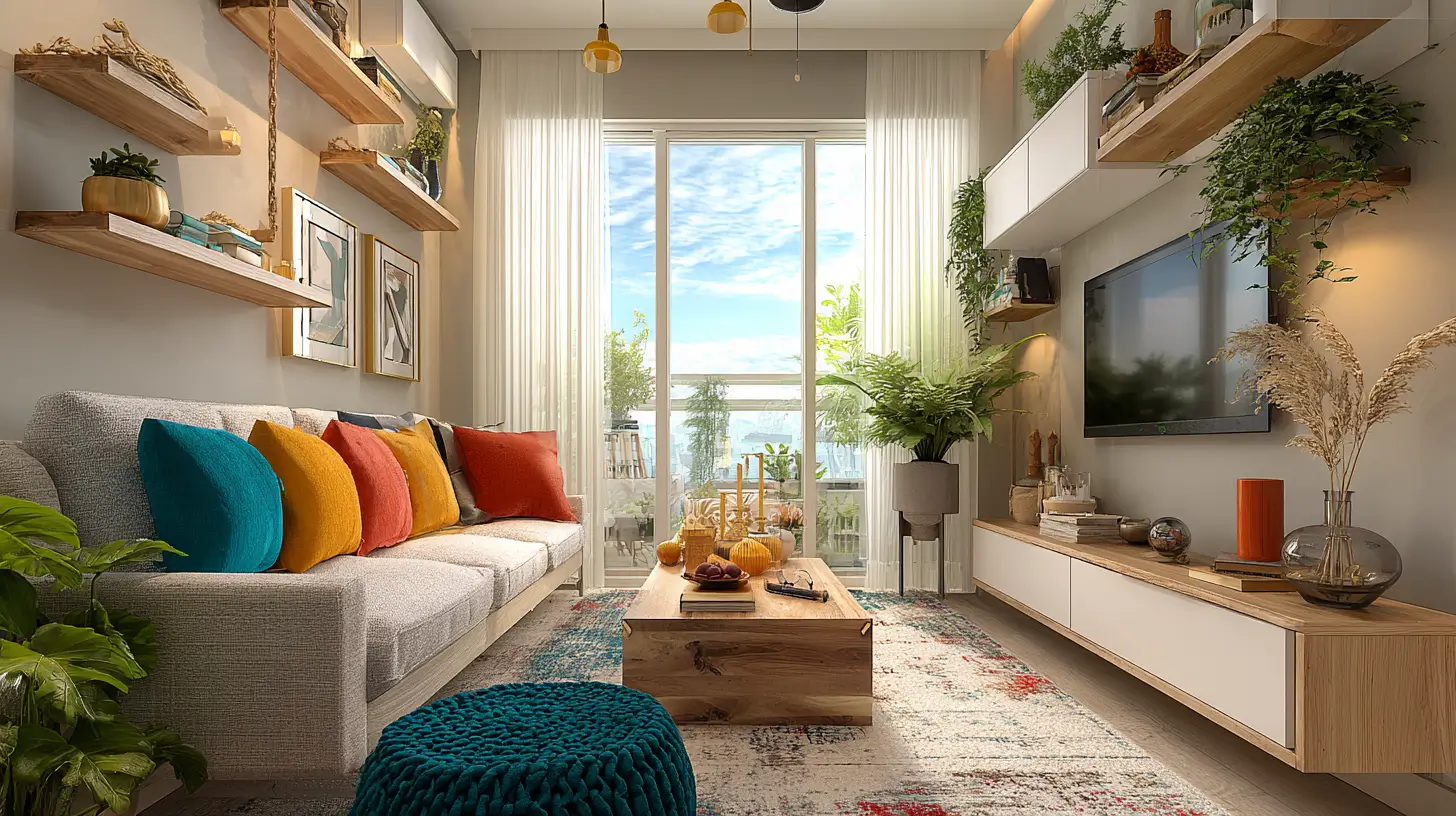
3. Use Vertical Space Like a Storage Architect

Floor space is precious. Wall space is free.
Go up to 8 feet high. Most people stop at 5 or 6 feet. That’s wasted opportunity.
Use the 70/30 rule for storage: 70% closed cabinets (hides clutter) and 30% open shelves (shows pretty things).
Ceiling-mounted shelving is perfect for items you use once a month. Holiday decorations. Extra pillows. Luggage.
Don’t forget door racks. The back of your interior doors can hold blankets, magazines, and remote controls.
And here’s a specific product tip. Standard bookcases are 15 inches deep. That’s too much for small rooms. Look for tall, narrow units at 12 inches deep or less.
Example: IKEA’s Billy bookcase (15” deep) eats floor space. Instead, use the Gersby (11” deep) or build custom 12-inch deep units.
Data: Zillow’s 2025 staging data shows that small living rooms with tall shelving appear 34% larger in photos.
🔑 Key takeaway: Look up. Your walls can hold way more than art.
4. Hack Your Lighting to Erase Corners

Bad lighting makes a small room feel like a cave.
Use corner floor lamps with swing arms. Aim the light upward. This lifts the ceiling visually.
Never rely on a single overhead light. It creates harsh shadows that shrink the space. You want multiple light sources at different heights.
Plug-in sconces are your friend. Mount them at 60 inches high. They draw eyes up and add soft light without electrician costs.
Try this $30 trick. Buy an LED strip light. Put it behind your TV or under your sofa. The backlight creates depth. Your wall will look farther away.
Expert quote (paraphrased): “Lighting is the cheapest square footage you’ll ever buy,” says designer Sarah Sherman Samuel in a 2026 Apartment Therapy interview.
Example: A Govee RGBIC strip behind a media console costs $30 and adds about 6 inches of perceived depth.
🔑 Key takeaway: Layer your lighting. Overhead + sconces + backlight = bigger room.
5. The “60-30-10” Color Rule, But Backwards

The classic color rule is 60% dominant, 30% secondary, 10% accent. For small rooms, flip the thinking.
Use 60% light neutral on walls and large furniture. Think off-white, light gray, or beige. This reflects light.
Make 30% a mid-tone on things like your sofa or rug. This adds warmth without heaviness.
Save the 10% dark accent for small items. Pillows, art, a single chair.
Paint your ceiling two shades lighter than your walls. Don’t use plain white. A lighter version of your wall color makes the ceiling feel higher.
Put a dark accent wall on the shortest wall only. This pushes that wall backward visually.
Avoid busy patterns on big surfaces. A patterned sofa will make your room feel chaotic.
Stat: A 2025 Sherwin-Williams study found that rooms with a darker accent wall on the farthest end tested 19% “more spacious” in blind surveys.
Example: Paint walls in “Alabaster” (white). Sofa in “Requisite Gray” (mid). Pillows and art in “Iron Ore” (dark).
🔑 Key takeaway: Light colors expand. Dark accents push walls back. Use both.
6. Replace Your Coffee Table With Something Smarter

A standard coffee table is 18 inches deep and 42 inches long. That’s a lot of floor space for something you barely use.
Use stacked nesting tables instead. Keep one out for daily use. Pull out the other two when guests arrive. They tuck away the rest of the time.
Pouf clusters are another great option. Soft, movable, and they double as extra seating. Three poufs cost less than one coffee table.
One large ottoman with a rigid tray is a power move. No sharp corners. Storage inside. And a tray on top holds drinks like a regular table.
Avoid glass-top tables. They show every fingerprint, dust speck, and water ring. They look dirty even when they’re clean.
Example: Target’s “Project 62” nesting tables cost $89 for a set of two. Diameters are 16 and 20 inches.
Pro tip: Choose tables with legs that angle inward. This makes the piece look lighter and takes up less visual space.
🔑 Key takeaway: Your coffee table should shrink when you don’t need it.
7. Hang Curtains Like a Con Artist (High & Wide)

Most people hang curtains wrong. They mount the rod right above the window frame. That shrinks the wall.
Mount your rod 4 to 6 inches below the ceiling. Not above the window. This tricks the eye into thinking the ceiling is taller.
Extend the rod 8 to 12 inches past the window on each side. When you open the curtains, they rest on the wall, not over the glass. You see more window and less curtain.
Only use floor-length curtains. No sill-length. No cafe curtains. Floor to floor.
Stick with solid colors. Patterns add visual noise. A single solid color blends into the wall.
Stat: A 2025 real estate staging report from Property Brothers Home Design found that high-hung curtains add an average of 14 inches of perceived ceiling height.
Example: A 36-inch wide window gets a 60-inch rod. Curtain panels sit mostly on the wall, not covering the glass.
🔑 Key takeaway: Curtains should frame your window, not cover it.
8. Declutter With “Visual Weight” Rules

Visual weight is how heavy an object looks, not how much it actually weighs.
A chunky sofa with a skirt looks heavy. A sofa with tapered, exposed wood legs looks light. You can swap legs yourself.
Amazon sells tapered sofa legs for about $25 for a pack of four. Installation takes 10 minutes with a screwdriver.
Open shelving reduces visual weight. Use it for 30% of your storage. Closed cabinets for the other 70%.
Wall-mount your TV. No media console underneath saves 18 to 24 inches of floor depth. Your room instantly feels wider.
Tool: Use the “squint test.” Squint your eyes at your room. Dark blobs have heavy visual weight. Move or replace them.
Example: A sofa with a skirt (heavy) vs. mid-century tapered legs (light). Same sofa, different legs, totally different feel.
🔑 Key takeaway: Light visual weight = bigger feeling room.
9. Add One Oversized Element (Yes, Really)

This sounds wrong. But it works.
One big thing makes the room look bigger. A single large piece of art (40 inches or wider) or a tall plant (5 feet or taller) creates a focal point. Your brain stops noticing how small the room is.
Avoid many small frames. A gallery wall in a small room looks like clutter. One big piece looks intentional.
Best oversized items for small rooms:
- Round mirror (48 inches)
- Large-leaf plant (monstera or fiddle leaf fig)
- One big woven basket in a corner
- A single large floor lamp with a wide shade
Expert quote: “A single 48” round mirror costs $80 at IKEA and doubles the perceived width of a room,” says interior blogger Chris Loves Julia in a 2025 YouTube video.
Example: A 6-foot tall fiddle leaf fig in a corner anchors the whole room. It becomes the star. Everything else fades.
🔑 Key takeaway: One big thing beats ten small things.
10. Use Rugs to Map Unseen Zones

A rug isn’t just for comfort. It tells your brain where one area ends and another begins.
Use one rug per zone. Sofa area gets one rug. Reading nook gets another. Even if they touch, your brain sees separate spaces.
Put only the front legs of your sofa on the rug. Leave the back legs off. This makes the rug look like it belongs to the seating area without overwhelming the floor.
Round rugs work great for small square rooms. They soften the corners and break up all the right angles.
Rug size rule: Your rug should be at least as wide as your sofa. Smaller than that looks like a bath mat.
Example: A 9’ x 12’ rug in a 12’ x 12’ room covers too much. Use a 5’ x 8’ under the sofa plus a 4’ round under a chair.
Stat: Ruggable’s 2025 customer data shows 5’x7’ is the top-selling rug size for living rooms under 150 square feet.
🔑 Key takeaway: Rugs are invisible walls. Use them to create zones.
11. Install Floating Shelves (But Follow the “Rule of Thirds”)

Floating shelves are great. But most people install them in boring straight lines.
Group your shelves in threes. One high, one medium, one low. Stagger them vertically. This draws the eye up and down, which makes the wall feel taller.
Keep the bottom shelf 12 to 18 inches above your sofa or console. Low enough to reach, high enough to not hit your head.
Follow the rule of thirds for what you put on them. Fill one third of your shelves with books (spines facing out). Fill one third with decorative objects (vases, small plants, ceramics). Leave one third completely empty.
Empty space is not wasted space. It gives your eye a place to rest.
Avoid matching pairs. Two identical candlesticks look stiff. One candlestick plus one small plant looks intentional.
Example: Three 24-inch floating shelves from Amazon ($18 each), staggered. Top shelf: trailing pothos plant. Middle shelf: three books plus a small ceramic bowl. Bottom shelf: empty.
🔑 Key takeaway: Shelves in threes. One third full, one third objects, one third empty.
12. Choose Seating That Doesn’t Face the Wall

Pushing all your seating against the walls makes the room feel like a waiting room.
Try this arrangement instead. One sofa plus two swivel chairs. The chairs can face each other or the TV. Swivel chairs let you change the room’s focus without moving furniture.
Look for swivel chairs under 28 inches wide. Anything wider eats too much floor space.
Avoid loveseats. They waste corners and don’t swivel. Two small chairs are more flexible than one loveseat.
Backless stools are a secret weapon. They slide completely under a console or table when not in use. Pull them out for extra guests.
Example: The “Poppin” swivel chair from Wayfair is 26 inches wide and costs $179. It fits in a 10-foot wide room with a 3-foot walking path.
Pro tip: Chairs without arms take up about 30% less visual space than chairs with arms.
🔑 Key takeaway: Swivel chairs give you options. Fixed seating locks you in.
13. Add Mirrors Where Corners Meet (Not Opposite Windows)

Most people put one big mirror across from a window. That creates glare, not depth.
Place two mirrors at 90-degree angles in a corner. Mount one on each wall, 6 inches from the corner. This creates an infinite depth illusion. Your corner looks like it goes on forever.
Avoid mirrored furniture except for one small piece. A mirrored console table is fine. A mirrored coffee table and mirrored shelves is too much.
Tilt your mirrors slightly downward. You want them to reflect floor space, not the ceiling. Floor space makes the room feel bigger. Ceilings do nothing.
Stat: A 2025 experiment by The Spruce found that corner-placed mirrors (two 24-inch rounds at 90 degrees) increased perceived room width by 22% compared to one large rectangular mirror.
Example: Two $25 mirrors from Target, mounted on adjacent walls 6 inches from the corner. Total cost $50. Total impact huge.
🔑 Key takeaway: Corner mirrors create fake depth. Window mirrors create fake glare.
14. Go “Paper Thin” With Your TV Wall

The biggest space killer in most small living rooms is the TV and its giant stand.
The 2026 trend is paper-thin TVs. Samsung’s The Frame (2026 model) is 32mm deep — about 1.25 inches. LG’s OLED evo is even thinner. These TVs look like picture frames when turned off.
Mount your TV on the wall. No media console underneath. Set the center of the screen at 42 inches high (eye level when seated).
Hide the cords. If you own your place, run them inside the wall. If you rent, use a cord cover kit painted to match your wall color.
Add one floating shelf below the TV. Make it 4 inches deep — just enough for a streaming box and a small plant. Nothing else.
Example: Samsung The Frame (2026) displays art when off. No bulky black rectangle ruining your room.
Cost: Cord cover kit from Amazon costs $12. Add a $8 sample pot of wall paint. That’s a $20 solution for renters.
🔑 Key takeaway: Your TV should hang flat and disappear when off.
Conclusion
You don’t need a bigger apartment. You need better small living room ideas.
Start with traffic flow. Measure your walking paths before you move anything else. Then layer in vertical storage, strategic lighting, and one oversized piece to anchor the room.
Replace standard furniture with transformers that do two or three jobs. Hang curtains high and wide. Put mirrors in corners, not opposite windows.
Pick just three ideas from this list to test this weekend. Measure your traffic path. Swap your coffee table for nesting tables. Hang those curtains high. Then post your before and after in the comments — we want to see every inch count.
These 14 small living room ideas prove that compact apartment design isn’t about less. It’s about smarter. Your small space living room layout just needed a 2026 refresh.
Now go make your room feel twice as big. You’ve got this.