Introduction
The wrong paint color can make a small bathroom feel like a storage closet. The right one can make it feel like a spa.
You’ve probably stood in front of a wall of paint chips feeling completely lost. One person tells you to go light. Another says bold colors are in. A blog says white is timeless. Another says white is boring. And now you’re more confused than when you started.
Here’s the truth: most people don’t pick bad colors because they have bad taste. They pick bad colors because nobody told them the rules behind why certain colors actually work in small bathrooms.
This article fixes that.
You’ll learn the specific paint colors interior designers use most in small bathrooms, the exact names and brand codes, why each one works, how finish can ruin a perfect color choice, and the five mistakes that make small bathrooms look even smaller.
No guessing. No vague advice. Just tested picks you can act on this weekend.
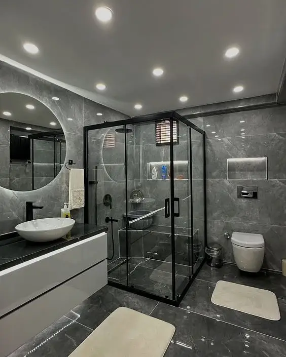
Why Paint Color Changes How Big Your Bathroom Feels
Here’s something most people don’t know: every paint color has a number attached to it called a Light Reflectance Value, or LRV.
This number tells you how much light a color bounces back into the room. The scale runs from 0 to 100. Zero is pure black. One hundred is pure white. The higher the number, the more light the color reflects, and the bigger your room feels.
Designers recommend LRV 60 or above for bathrooms under 50 square feet.
Why does this matter? Because small bathrooms already have very little natural light. Most of them have one overhead fixture and no window, or a tiny window above the toilet. When light hits a low-LRV color, it gets absorbed. The room goes dark. It shrinks.
When light hits a high-LRV color, it bounces around the room. Walls feel farther apart. Ceilings feel higher.
But LRV isn’t the only thing that matters. Undertones do too.
Every paint color has a hidden tint inside it. A gray might look neutral on the chip but reveal pink or green undertones once it’s on the wall. In bathrooms with cool LED lighting (which is most builder-grade bathrooms), cool-toned colors look sharper and cleaner. Warm-toned colors can look muddy or yellow under that same light.
And here’s one more thing worth knowing: contrast between your floor and your walls makes the room feel taller. A dark tile floor with a light wall creates a visual line that draws the eye up. That’s why designers often use light colors on walls even when a homeowner wants something dramatic.
Now that you know what actually makes a color work, here are the specific colors that check every box.
The 8 Best Paint Colors for Small Bathrooms
These aren’t random picks pulled from a trend board. These colors show up repeatedly in real designer projects, client portfolios, and before-and-after renovations. They work because of their LRV, their undertones, and how they behave in different lighting conditions.
Here they are, from the cleanest whites to one bold choice for the confident decorator.
1. Chantilly Lace by Benjamin Moore (OC-65) | LRV: 92

This is the white that designers reach for first.
Chantilly Lace has almost no yellow or pink undertone. It reads as pure, clean white no matter what lighting you put it in. Most whites betray themselves under cool LED light by turning faintly yellow or blue. This one stays true.
Pair it with: white or light gray tile, chrome or brushed nickel fixtures, and bright white trim in semi-gloss.
Best for: windowless bathrooms, bathrooms with cool overhead lighting, and anyone who wants a crisp, hotel-clean look.
2. Simply White by Benjamin Moore (OC-17) | LRV: 89.5

This one is slightly warmer than Chantilly Lace. It works better in bathrooms that get some natural sunlight, because that warmth doesn’t tip into yellow under natural light.
If your bathroom has a window and you want something a little softer than a stark white, Simply White is the move.
Pair it with: warm wood vanities, matte black fixtures, or warm beige tile.
Best for: bathrooms with natural light, farmhouse or transitional style bathrooms.
3. Pale Oak by Benjamin Moore (OC-20) | LRV: 69

Pale Oak is a warm greige. That means it sits between beige and gray, leaning slightly warm.
If your bathroom has cold white tile or chrome fixtures that feel sterile, Pale Oak brings in some warmth without going full beige. It makes the room feel less clinical and more comfortable.
Pair it with: white subway tile, brushed gold or matte black fixtures, natural wood accents.
Best for: bathrooms with cool-toned fixed elements like white or gray tile.
4. Sea Salt by Sherwin-Williams (SW 6204) | LRV: 74

Sea Salt has been one of the most pinned bathroom colors since 2022, and it’s still earning that attention in 2026.
It’s a soft mix of sage green and aqua. It doesn’t read as strongly “green” or strongly “blue.” It just feels calm. Spa-like. Easy.
Pair it with: white trim, white fixtures, and natural materials like wood or stone.
Best for: bathrooms with neutral or white tile, homeowners who want a relaxing feel without going too bold.
Designer Note: Sea Salt can look more blue or more green depending on your light source. Test it in your actual bathroom before buying a full gallon.
5. Comfort Gray by Sherwin-Williams (SW 6205) | LRV: 60

Comfort Gray is a close neighbor to Sea Salt but sits more on the cool gray-green side. It’s subtle enough to feel neutral but has enough color to avoid looking like just “another gray.”
This is the pick for people who want a soft color without committing to something obvious.
Pair it with: white fixtures, gray tile, chrome hardware.
Best for: modern or transitional bathrooms, bathrooms with cooler natural light.
6. Pale Smoke by Benjamin Moore (2125-40) | LRV: 67

Pale Smoke is a dusty periwinkle-gray. It’s one of the more elevated options on this list.
Most people don’t think to put a soft purple-gray in a bathroom, but it works because it reads almost like a neutral from a distance while still having personality up close.
Pair it with: brass or gold fixtures, white marble tile, white trim.
Best for: bathrooms where you want a slightly more designed, intentional look without going dark.
7. Coventry Gray by Benjamin Moore (HC-169) | LRV: 56
Coventry Gray is a classic cool gray. It has been a staple in interior design for years and shows no signs of dating itself.
Note that LRV 56 is on the lower end of what designers recommend for small spaces. This color works best when your bathroom has at least one window or decent overhead lighting.
Pair it with: white trim in semi-gloss, chrome or brushed nickel fixtures, white or light gray tile.
Best for: bathrooms with natural light, homeowners who want something timeless and unfussy.
8. Hale Navy by Benjamin Moore (HC-154) | LRV: 7

This is the bold pick. And yes, it works in small bathrooms, with conditions.
Hale Navy is a deep, classic navy blue. LRV of 7 means it absorbs a lot of light. So why would a designer use it in a small bathroom? Because when everything else in the room is bright white (fixtures, trim, tile), the dark wall creates dramatic contrast that actually draws the eye around the room rather than making it feel smaller.
Pair it with: bright white trim in semi-gloss, white fixtures, brass or gold hardware, and good lighting.
Best for: bathrooms with white or very light tile, at least one window or a strong overhead light, and homeowners who want drama over softness.
Be honest with yourself: If your bathroom has no window and one weak ceiling light, skip Hale Navy. It will feel like a cave.
Not sure which of these is right for your specific bathroom? The next section walks you through exactly how to decide.
How to Pick the Right Color for Your Bathroom in 5 Steps
Before you order a gallon of anything, run through this check.
Step 1: Identify your light source.
Natural light? Artificial light? What kind of bulb do you have? Warm white bulbs (2700K to 3000K) shift cool grays toward greige. Cool white bulbs (4000K to 5000K) make warm colors look flat. Knowing this before you pick a color saves you from a $60 mistake.
Step 2: Look at your fixed elements.
Your tile, grout, vanity, and floor aren’t going anywhere. Your paint needs to work with them, not against them. If your tile is warm-toned (cream, beige, tan), lean toward warm neutrals or cool soft colors that create contrast. If your tile is cool (white, gray, blue), you have more flexibility.
Step 3: Decide on the mood you want.
Do you want calm and spa-like? Crisp and clean? Bold and dramatic? Pick one. Each of the eight colors above maps to a specific feeling. Don’t try to hit two moods at once.
Step 4: Test with large swatches.
This is where most people skip a step and regret it.
Don’t paint a small patch directly on your wall. Buy peel-and-stick samples from Samplize. They’re 12 by 12 inches and repositionable, so you can move them around the room. Place them near your tile, near your vanity, and near your window. Leave them up for 24 hours and check them at different times of day.
A 2024 Houzz survey found that 67% of bathroom renovators said they regretted not testing paint colors before committing. Don’t be in that group.
Step 5: Check the color at night.
Bathrooms get used in the morning and at night. A color that looks great at noon under natural light might look completely different at 7pm under your bathroom vanity light. Always check your samples after dark.
Once you’ve locked in your color, there’s one more decision that matters just as much: the finish.
Paint Finish: Why It Matters as Much as the Color
You can pick the perfect color and still ruin it with the wrong finish. This happens more often than you’d think.
Here’s what each finish does in a bathroom:
Flat or matte: Do not use this in a bathroom. Flat paint absorbs moisture. It can’t be wiped clean. Mold loves it. Skip it entirely.
Eggshell: This is the minimum acceptable finish for bathroom walls. It has a very slight sheen and can be wiped down. It works, but it’s not the best option.
Satin: This is the designer’s first choice for bathroom walls. It reflects light gently, which helps a small space feel larger. It cleans easily. And it hides minor wall imperfections without looking shiny.
Semi-gloss: Use this on trim, doors, and ceilings. The higher reflectivity on the ceiling helps it feel like it’s floating upward, which adds visual height to the room.
High-gloss: This is a statement finish. It looks striking in photos, but it shows every single wall imperfection. Only use it on very smooth, properly prepared surfaces.
The formula that works: Satin on walls. Semi-gloss on trim and ceiling.
Two specific paint lines worth the extra cost: Benjamin Moore Aura Bath and Spa is formulated for high-humidity rooms and holds up better over time. Sherwin-Williams Emerald Interior in satin is another premium option designers use regularly.
Getting the finish right costs nothing extra when you’re already buying paint. Getting it wrong means redoing the job.
5 Color Mistakes That Make Small Bathrooms Look Even Smaller
Even a good color choice can backfire if you fall into one of these five traps.
Mistake 1: Painting the ceiling the same color as the walls.
This is the most common one. When walls and ceiling are the same color and LRV, the room feels like a box. The ceiling should usually be one to two shades lighter than the walls, or simply painted pure white. This creates separation and pulls the eye upward.
Mistake 2: Choosing your color under store lighting.
Paint stores use fluorescent lighting. Your bathroom probably doesn’t. A color that looks crisp and clean under fluorescent light can look greenish, pink, or yellow in your actual bathroom. Always bring chips home and view them in your own space before buying.
Mistake 3: Going greige when your tile is already warm-toned.
This is called the greige-on-greige trap. Warm tile plus warm greige paint doubles up on warmth. The room ends up looking muddy and heavy. If your tile runs warm, choose a cooler soft color like Sea Salt or Comfort Gray to create some contrast.
Mistake 4: Ignoring the grout color.
Dark grout lines on light tile create a visible grid pattern on your walls. When you add a light paint color, that grid pattern becomes even more obvious. It visually breaks up the space and makes it feel busier. If you have dark grout, account for it when picking your wall color.
Mistake 5: Chasing a trend without checking if it will date fast.
Ultra-trendy colors have about a two to three year shelf life in a bathroom. Once you repaint, you’re buying new paint plus spending the time to do the job again. The safer move is to use a timeless base color on the walls and bring trends in through towels, a mirror frame, or cabinet hardware.
Avoiding these five mistakes alone puts you ahead of most people repainting a bathroom this year.
2026 Bathroom Color Trends Worth Knowing (But Not Obsessing Over)
Trends are useful context. They’re not rules.
Here’s what’s happening in bathroom color in 2026 so you can decide whether any of it fits your space.
Warm whites are replacing cold whites. The stark blue-white look that dominated the 2010s is fading. Homeowners are moving toward whites with a subtle cream or warm undertone. Simply White and Pale Oak both fit this direction.
Earthy greens are everywhere. Sage, moss, and soft olive tones are being used heavily in bathrooms right now. They feel organic, calming, and connected to nature without being loud. Sea Salt sits at the edge of this trend.
Moody colors are moving to one wall. Full-room dark bathrooms are less common than they were two years ago. Instead, designers are using deep navy, charcoal, or dark green on a single accent wall or painted vanity. The rest of the room stays light.
Warm clay and terracotta are appearing in powder rooms. Not main bathrooms, but small guest bathrooms and powder rooms are getting warmer, earthier tones. These are harder to pull off in spaces with cool white tile, so proceed carefully.
The big picture for 2026 is biophilic design. Colors drawn from nature are driving most decisions right now: sand, stone, bark, water, moss. The palette is muted, warm, and grounded.
Sherwin-Williams named Quietude (a soft blue-green) as its 2025 Color of the Year, and colors in that family are still carrying momentum. Benjamin Moore named Cinnamon Slate, validating the earthy and muted direction. Pantone’s 2025 pick, Mocha Mousse, confirms that warm brown tones are moving into interior spaces.
Pinterest data shows searches for “sage green bathroom” up 40% year over year as of 2025. That trend is still moving.
The safest approach in 2026: choose a timeless base color for your walls and bring the trend in through towels, hardware, and accessories. That way you’re current without being stuck.
Conclusion
The best paint colors for small bathrooms aren’t mysterious. They work because of specific things: LRV, undertones, finish, and how they interact with your lighting and fixed elements.
Here’s what to take from this article. Choose a color with an LRV of 60 or above if your bathroom has limited light. Always test large swatches in your actual space before committing. Use satin on walls and semi-gloss on trim. And avoid the five common mistakes that make even good colors fail.
Pick two or three colors from this list. Order peel-and-stick samples. Test them this weekend in your actual bathroom under your actual light. Your bathroom transformation starts with a $5 sample, not a full gallon.
The best paint colors for small bathrooms aren’t a secret. They’re just the ones chosen with intention.
Meta Description: Designer-tested paint colors for small bathrooms in 2026. Real color names, LRV data, finish tips, and mistakes to avoid.